From cutesy to sophisticated: is this the kindergarten of the future?
You can’t help but have noticed the recent proliferation of early childhood education centres scaled like corporate offices but demarcated for their client group through the predictably cutesy livery of primary colours.
It’s already a $14 billion-a-year industry with almost 14,000 centres scattered across the continent.
Courtesy of a pending program that, from 2025 in Victoria and 2030 in NSW, will pump many more billions into the sector to allow four- to five-year-olds an extra full year of “play-based learning”, more centres will pop up throughout our communities over the next decade.
The side benefit of the additional “pre-prep” year is that it will theoretically allow more working-age mums to get back to the office.
Yet, while there seems to be a rather lacklustre design typology to the majority of these facilities, one in suburban Melbourne that has established a refreshingly different direction has been recognised by the Victorian School Design Awards 2022 as the best kindergarten and early learning centre.
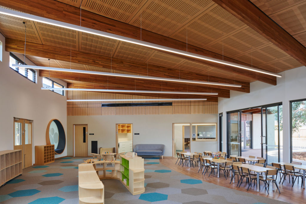
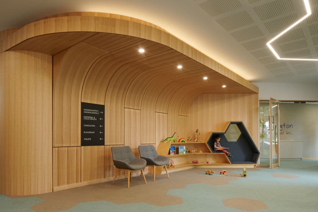
Woody, curvy, bereft of block colourations and instead focusing on the sky and trees outside, and uncluttered spatiality inside, the Wellington Child and Family Hub in Dan Andrews’ electorate of Mulgrave, was designed by AOA Christopher Peck architects and was based on a premise that the children, rather than the building, would provide the colour and movement.
“The building was the canvas, and the aesthetic of the interior brief was to keep it minimal,” Peck says.
The client in this case was the City of Monash, which needed to replace an outdated kinder and maternal health centre. The architectural firms that tendered for the job were given a notional brief that would retain the significant native trees on the site and essentially squash the buildings away from them into a back corner of the site.
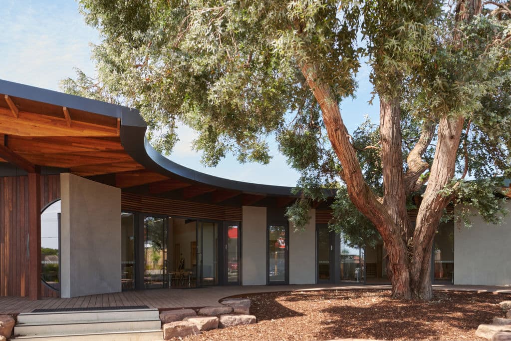
When AOA Christopher Peck won the job, the studio’s creatives threw these building blocks into the air and came up with a centre that instead was formed to hug the most majestic eucalypt inside a semi-circular embrace, and that cleared out the floor space, especially in the two kindergarten rooms, “to create little zones through the use of loose furniture and beanbags”.
In a repeating scheme of circles and curves and other geometries that are part of the building structure, even something as subliminal as carpeting can animate imaginative play. “With hexagonal carpet tiles, we created almost little islands that encourage the kids to jump from place to place across the room,” Peck says.
Staying organic and breaking it down to basics, “we didn’t overstimulate with colours, mechanisms and equipment”, he adds.
“What equipment we did use became part of the landscaping and, in fact, the main play area is the [tiers of] boulders that the children jump off.”
The wonderful timbered quality – which is evident throughout the interconnected maternal health facilities at the rear, the multipurpose community room and the secure kindergarten sector of the building – introduced a gentleness to the aesthetic, the architect says. “The timber has a softness and a residential feel to it.”
Soft, too, is the airy flow of the buildings as they transmute through their multiple functions. Peck says that one of the elements AOA concentrated on was the efficiency of spaces that made the project possible on the budget. It was mostly conceived from a child’s point of view.
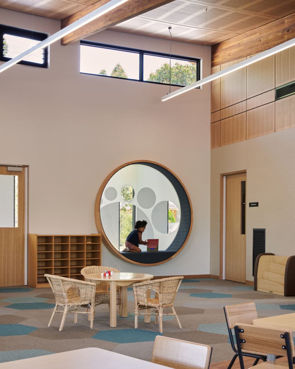
“When we do our renders, we take them from a metre off the ground so we can experience them as children do,” he says. “So benches and windows are lower.”
In the waiting room or common foyer for the three aspects of the facility, there is, Peck points out, “no front-of-house reception desk because the idea was to make it a little less formal and a lot more inviting”.
The overhanging timber element above the seating “provides a comforting scale drop which is like a wave element”. The shelving invites children’s interaction, as does the “niche or portal” expressly made as a little cave “that children find a nurturing and comforting space”.
The organic comforts of the project, that took such strong cues and borrowed shade from the canopy of the magnificent tree at its heart, delivered an ill-timed irony shortly after the project was completed.
“Despite all the gymnastics we went through to keep it,” Peck says, “unfortunately the tree was found to have a fungus and it needed to be replaced.” The new tree should grow nicely alongside its main user group.