Within the apartment and nonchalant smallish business neighbourhood that in the past decade has grown out of the grunge and graffiti of industrial Collingwood is the coolest new coffee shop.
The back lane business is dimly lit and has no tables or chairs in a 150 square metre bricky space with a 6.3-metre-high ceiling. It’s been fitted out by architects, and in keeping with its scheme of extreme sparseness, the jazz is such quiet auditory background that you can hear yourself think.
Ula Cafe, which opened in early December, has no signs – inside or out – but the patrons in their sneakers and headphones, and sometimes with dogs in tow, saunter in for coffees, teas and pastries, and a chat with owner Han Xue and each other.
While waiting, they mill in the voluminous empty space, lounge on the thick-set corner bench, or outside under the circular canopy, where, although he could have tables and chairs, Xue had his architects, SuiL, install a broken circle of backless benches instead.
In a town where good coffee is lifeblood, none of this is normal for a commercial cafe. But Ula is housed in an exceptional heritage building that both proprietor and architects have allowed to speak for itself.
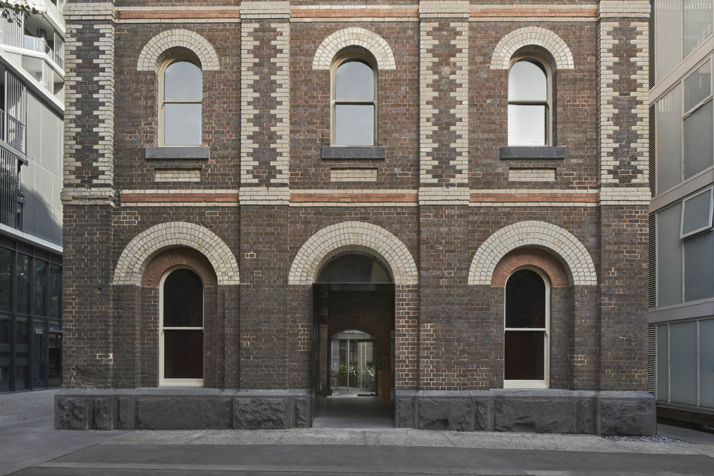
The cafe occupies the ground floor of a magnificently-restored, heritage-listed 1876 tower. It belonged to the Yorkshire Brewery that in the late decades of the 1900s – when Melbourne boasted one pub for every 250 people and had 126 commercial breweries – took up 0.81 hectares on the north side of Wellington Street.
Bought by Carlton & United in 1909 and given various different roles including as a malt house, the tower and brewery estate became redundant in the 1980s and for decades following. Like most of the original Hawthorn brick fabric, the seven level polychrome brick tower was progressively trashed by vandals.
They even graffitied the slates on the Second Empire-style mansard roof.
This sad state was reversed when SMA Projects kept the best remnants and made the expensively restored brew tower the centrepiece of a very interesting development of 338 flats, 18 townhouses, and many retail spaces and small enterprises that in 2015 manifested as a fine-grain precinct ranged along bluestone lanes.
It’s like a small scale version of New York’s Soho or Meatpacker districts. And it makes a lot of inner city Melbourne look a tad dated.
Looking for a venue to do a cafe and photographic gallery, in 2018 Han Xue and his wife found the recently vacated tower space and bought in architect partners Songyun Sui and Andy Liu of SuiL to look it over.
His brief to the design team who work both in China and Australia, was to make it resonate with “my personality. I’m a quiet person”. Xue liked that the tower was stashed well off the main Wellington Street drag. “It’s hidden because I really wanted it to be discovered by word of mouth”.
He wanted it to be a genuine community hub and to date, that’s the patron profile. “The office people and the neighbours,” he says.
When architect Andy Liu first saw the room, it had wall mirrors, pendant lights and wooden flooring left by a former tenant. He and was happy to strip all of that out but leave the white graphics painted onto the mottled bricks and the massive bluestone foundation blocks. “They’re beautiful.”
Liu and Sui were happy to follow the brief and keep the appointments super simple. Rather than “conflict with the heritage, our approach was to co-exist with it and let the heritage elements inform the design.”
The gorgeous arched window openings created a datum line for the chunky and apparently concrete fittings of counter, rear wall service bench and opposing corner seating shelf.
“Our original idea was raw concrete but that was too heavy and might impact the heritage. So, we built and panelled the structures with a lighter product called luxury concrete,” Liu says.
To level the floors to the external ground, the timber floor was removed, a substructure was installed and tiled with porcelain that looks like big slabs of bluestone.
The material and spatial approach was to stick with the tonalities in the bricks and keep the core of the cafe open as a pedestrian through route and as an exhibition and function space for future events.
That also explains why the high up lighting is of gallery quality and why the beautiful walls of an almost 150-year-old brew tower are so bare – at the moment.
For a tertiary-trained photographer like Han Xue, who for now is a cafe operator, that flexibility is exactly what he wanted.
