How architects Bates Smart made the new wing of the Cabrini Hospital in Malvern feel more like a hotel
Even for a long-established architecture firm with an improbably diverse portfolio of big, expensive new buildings, bringing a successful, state-of-the-art hospital out of the ground is among the most challenging and complex of all the projects it can take on.
“No doubt about it,” saysKristen Whittle, director of the 165-year-old firm Bates Smart.
“Hospitals are the ultimate challenge because you’re trying to generate a profoundly functional building that also considers how the human mind works; the effect that natural light and access to views of nature have on the body’s chemistry, and how the flow of spaces work not only for people who are less mobile, but how the environments impact on the nurses and doctors.”
The just-opened, $120 million Gandel Wing at the Cabrini complex in Malvern, in middle-ring suburban Melbourne, is not the most expensive medical facility Bates Smart has created.
The 2011, $1 billion Royal Children’s Hospital in Parkville and the $630 million new Bendigo Hospital that won a multiplicity of awards for the practice last year were both degrees larger.
But the seven-level, 138-bed new Cabrini Clinical Services wing is so different “in its comfort and warm character from institutional buildings that can create so much fear in people who are ill”, says Whittle, “that it feels like a blend between a hotel and a hospital”.
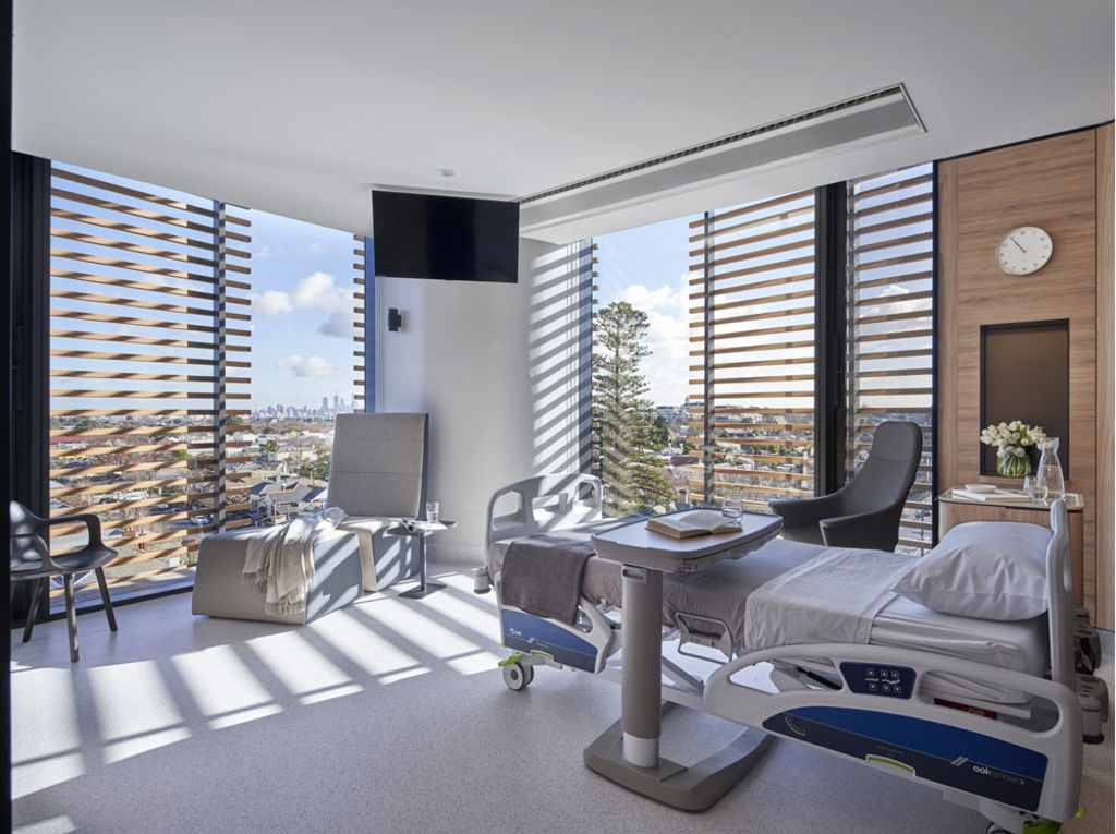
Being encouraged by the Cabrini management to model the wing for wellness and primarily with the patient’s perspective in mind, the wood-veneer lined hospital rooms do indeed have an almost domestic sense of scale and comfort.
Bates Smart talks of the decor as “soft, serene and tranquil”. Corners are rounded, windows are openable, artificial lighting is subdued and during the daytime is subservient to natural light.
“Every effort has been made to look at the ergonomics and hide all of the mechanical and technical plug-in points that usually surround a patient,” Whittle says.
And because the building is set high above its suburban context, it has far-seeing outlook to distant mountains, which the hospital rooms set around the perimeter and the picture window set into at the ends of corridors can all take advantage of for “views of the world that make you feel better”, according to Bates Smart studio director Mark Healey.
By banishing what he calls the usual “clinical haze and minimising the machinery build-up”, Healey says the facility that incorporates specialty cancer, cardiac, maternity and emergency services, along with a 150-seat auditorium, set out “to create new norms for facilities that do have to be clinical and relate to safety, but that can also be welcoming and really positive environments”.
The science of therapeutic architecture is relatively young “but it is starting to be understood”, Whittle says, “that the pure white [artificial] light that most hospitals use inhibits the natural production of serotonin [a mood-elevating neurotransmitter]”.
With Cabrini having one of the oldest average client groups in Australia, a lot of planning went into “keeping patients as safe as possible and especially in a situation where most falls tend to occur at night,” says Healey.
Bates Smart challenged the accepted design guidelines for hospital rooms in reorienting the placement of en suites so they face towards rather than away “from the hospital bed of a probably disoriented patient and by installing lighting that is activated by sensors that can read people’s movements within a room”.
This includes hand rails that can be activated by touch. Low lighting in en suites is another aspect of keeping the environments calm.
“Softness and curves not only mimic the way light falls on natural elements but also diminish the amount of damage that moving machinery, trollies and beds can have on a hospital environment,” Healey says.
The terracotta screening that wholly envelopes the building relates to the red brick heritage-rich suburb and also moderates overly strong sun ingress into the rooms.
“The screens allowed us to use full-height operable [openable] windows.” This allows fresh air to be part of the healing program.
More research will validate the therapeutic value of spending on such supportive environments so that they do become the norm. “Hopefully, this one is not a niche building but will be transformative in being a hospital that focuses so much on the patient experience,” Healey says.
Whittle says Melbourne is already a benchmarking city in creating revolutionary new hospitals because boards and their architects “start off with inspired, world-class thinking”.
And, he believes, when architecture does line up more accurately with its ultimate purpose of being an extension of the human body, “architecture will work more truly like a life-support system”.
www.batessmart.com

