Racecourse's new stand 'like a great ocean liner'
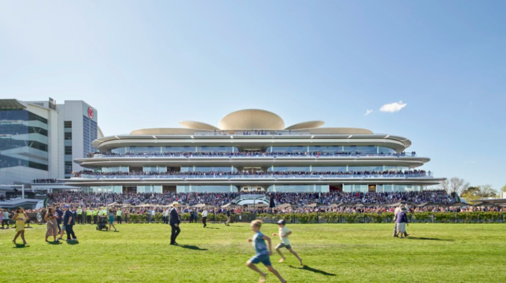
The Club Stand at Flemington Racecourse, designed by Bates Smart, has given the track a completely new focus, along with those using it.
Replacing a 1920s grandstand, badly damaged and beyond repair, this streamlined contemporary edifice, has a distinctly 1930s modernist feel.
With rounded glass edged windows, tiered with wrap around terraces one can easily recall the great ocean liners that took to the sea during the interwar period.
However, for interior designer Jeff Copolov, who worked closely with the firm’s architectural principal Kristen Whittle, fashion, as much as architecture drove the outcome.
“When it comes to racing, it’s all about the fashion and being seen,” says Copolov, who compares the building’s crown to a flamboyant hat a milliner would concoct for the racing season.
Other elements of the stand, including the sweeping staircase, are referred to as a ‘vertical catwalk’.
Unlike the former stand, with views only in one direction, Whittle and his team were keen to embrace the entire working of the course: from the mounting yards, the new shelters for bookies and importantly, the ‘home stretch’.
Hence, Bates Smart’s design features round-cornered windows with structural columns set away from windows, and the central core at each of the building’s five levels are left open to allow unimpeded sightlines.
Views to the members’ lawn, the home stretch, and also sharp city vistas can now be enjoyed.
Commissioned by the Victoria Racing Club, and strongly led by the board’s Chair, Amanda Elliot, there’s a singular vision that runs through the design.
Sculptured ceilings continue out to the terraces giving The Club Stand a certain lightness, while the membranes on the crown create one of those ‘architectural moments’.
Although there’s a strong cohesiveness that extends over all levels, Bates Smart had to create 14 different ‘signatures’ in defining the variety of food and beverage offerings within.
From the full dining experience to a food court and even a simple pastry shop, there’s great attention to detail at every turn.
The GH. Mumm Champagne Bar includes as its centrepiece a dramatic 50-metre-long highly lacquered red ‘ribbon’.
This floats above the sinuous-shaped bar, evocative of the ribbon displayed on each champagne bottle.
Copolov also took cues for the interior from the British, given Australia’s racing traditions stem from there.
“I was inspired by British textiles, as much as from some of the current fashion designers, such as Paul Smith,” says Copolov, pointing out the customised striped carpet used for the Bluegrass Bar.
Other areas feature the traditional herringbone pattern but skewed to a larger size to create a more contemporary effect.
One of the other drivers in Bates Smart’s design was the need to link the adjacent buildings, such as the committee rooms from the 1990s, in such a way as to ensure the field was used by the jockeys and not by crowds who could damage the grounds.
Hence, walkways link these buildings and create a sense of a unified design.
For those who want to be surrounded by greenery, there’s the roof terrace, also hired out independently for private functions.
For Copolov, the Flemington Racecourse fashion was pivotal to the design.
Model Jean Shrimpton’s presence at the 1965 Derby Day, wearing a knee-length shift-style dress, forms an important part of the club’s history, as does the exuberance of flimsy floral fashion worn at the races today.
“The crown has been compared to a flower as much as a hat, but then again, the roses that bloom on Cup Day, were as important in shaping the interior spaces,” says Copolov.
At a time when people need a reason to get off their couches and see the real thing, The Club Stand, recipient of numerous architectural awards (including from the Australian Institute of Architects (Victorian Chapter)), will surely encourage punters to ‘smell the roses’.


