Sirius question: Should Sydney's most controversial building stay or go?
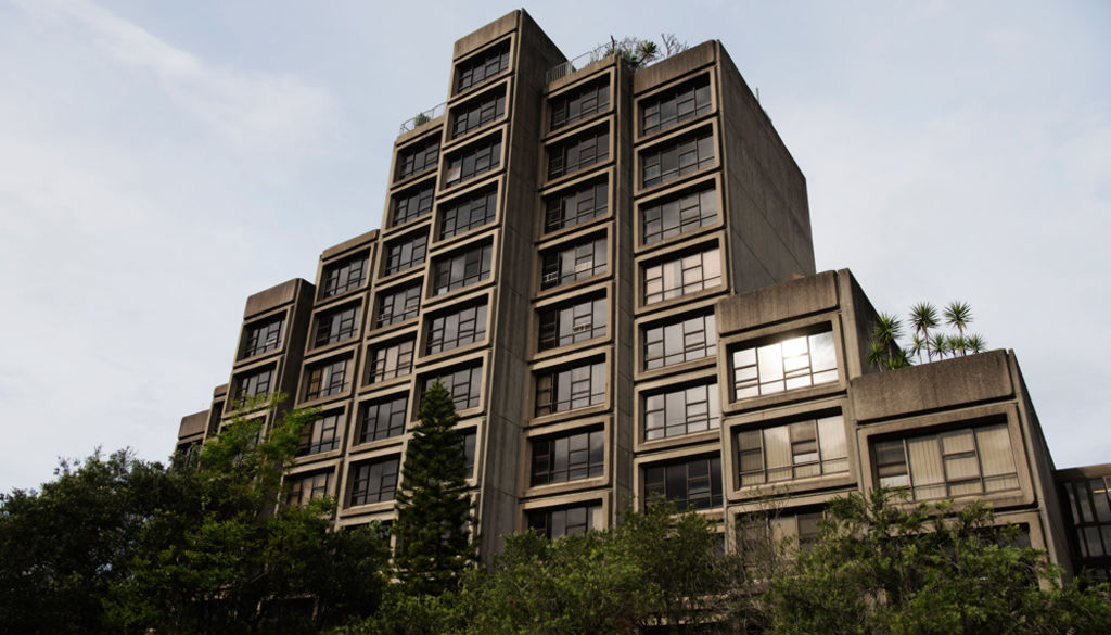
The CFMEU construction union has declared a Green Ban over Sirius, a 1980 NSW Housing Commission block, in the brutalist architectural tradition, in The Rocks in Sydney, defying state government plans to demolish it.
The move last week was a repeat of the early 1970s when similar action by the Builders Labourers Federation halted state plans to demolish rundown public housing in The Rocks, relocate long-term residents and redevelop the area with tall towers.
That deadlock was broken in 1975 when the government agreed to Resident Action Group demands that the area remain a residential and historic precinct and for a building to rehouse displaced residents. Any such building required a social mix, with one, two, three, and four-bedroom units and aged units. Nor was it to be a sheer rectilinear block, they specified.
 The view from apartment 101 of the Sirius building on the day of the Save Our Sirius protest rally. Photo: James Brickwood
Tao Gofers
Former Grade 4 NSW department of housing architect, designer of Sirius
“On a Wednesday afternoon – I can’t tell you the exact date – they said, ‘We’ve got to do a couple of proposals by next Friday’.
“We had 10 days to do a proposal that was acceptable to the Residents Action Group, okay to the BLF, the premier’s department, the department of housing, the Sydney Cove Redevelopment Authority (now the Maritime Services Board) and a few other interested people.
“We had to convince this diverse group to actually accept the proposal we made. I said to one draughtsman: ‘Do 14 Victorian terraces. Do a nice drawing, a bit of economic analysis, and I want you to finish it by next Thursday.’ He went away. I said to another draughtsman: ‘Draw me a 20-storey building and finish it by next Thursday.’ And he went away. Then I said to a third guy: “Take three standard housing commission flats and put them on the site, in around 70 to 80 units.”
“I then went to my best draughtsman. On Thursday, the second day, we had a look at the site. The site runs north-south, alongside the rail bridge. An eight-carriage train from Milsons Point to Wynyard produces 108-110 decibels. I thought you could stagger the front of the building so when noise hits the face, it actually breaks up. Then you face the window slightly away from the noise source. We built a very nice model.
 Sirius designer Tao Gofers says the staggered front of the building breaks up the noise from passing trains. Photo: Michele Mossop
“Ten days later, we were at the meeting with the residents action group, the Sydney Cove Redevelopment Authority (now the Maritime Services Board), the premier’s department, the housing commission and the BLF.
“I pulled up the proposal for the 14 Victorian terraces. The Residents Action Group thinks, ‘This is fantastic’, but the premier’s department said ‘This is going to cost $300,000 per unit for land cost’. Then we presented the 20-storey high-rise. The premier’s department thought this was fantastic, while the Residents Action Group said ‘This is exactly what we don’t want’. We showed them the three standard housing commission flats, which even today are dreadful.
We then took the cover off our real proposal – with beautiful perspectives, a nice model, good colours and, of course, the economics were correct. It was a lay-down misere. Everybody was happy.
“Initially there was some major criticism. One was all the people living in The Rocks free wanted to stop it because they would [then] have the Green Bans reimposed and wouldn’t have to pay rents on their leases. There were some people who honestly didn’t like it. Norman Day, an architectural critic from Melbourne, said it was the perfect place for a scene out of Clockwork Orange.
 Inside the Sirius building in the area known as “The Gallery”, designed as a reading room. Photo: Peter Braig
“By 1995, people were starting to change their mind. There’s a lot of people that like the building a lot.
“On the ninth floor, we have an aged community room. On the south wall is a mural of the city as it was in 1976. We had special buttons so if someone were to fall over in an aged unit, the resident general manager could throw a switch so they could get in. There’s parking underneath, with areas where you could drive a six-tonner, a fairly high truck, in to unload your furniture. It complies with all the things people want today.
“My biggest mistake was that I had originally made the concrete white, using white cement. As it was coming out of the ground the quantity surveyor in the department of housing said ‘We’re going to be $200,000 over budget … what we’ve got to do is change the white concrete to off-white’, and I agreed.
 The colour of the concrete is a decision Tao Gofers regrets. Photo: James Brickwood
“I allowed myself to be convinced. That was the stupidest decision I ever made. We should never have done that. Instead of being a nice cream colour, it became a grey colour.
“The building would have been so much lighter than it is now. It was this stupid decision on my part. The minute we finished the building, I regretted it. Every time I drive by the building I think “My God”. I could have done that job better if I had had another week.”
Claire McCaughan
Co-director Archrival, former director Sydney Architecture Festival
“The Rocks for me, does have heritage. It doesn’t have to be heritage from 100 or 200 years ago. The Rocks is an evolving place with lots of different vintages and just because it’s a newer building doesn’t mean it’s any less valuable.
That building is amazing. Coming from a distance, it’s graphic and old. Our city should have more brave buildings like that.
“But from really close up, it has this amazing quality of what architects call ‘human scale’.
 Claire McCaughan: ‘Architects don’t think it’s ugly. It’s not supposed to the pretty.’ Photo: Peter Braig
“You can walk in without feeling intimidated by it. It’s got this scale that matches your body; the courtyards are at ground level. As an ordinary citizen, you can walk straight into those gardens. It’s got this lovely scale to it you find in laneways, pocket parks. It suits that area really well.
“I don’t think it’s ugly. Architects don’t think it’s ugly. It’s not supposed to be pretty. But the way our city is made up, and the way any city is made up, it’s a structural thing, with big pieces of infrastructure, roads, bridges – and the Opera House – and that small brutalist portion of our city fabric just adds to the character. It’s really sculptural. When it was looked after a bit more and had purple chimneys, it was really playful. It looked like stacks of building blocks.
Sam Marshall
Museum of Contemporary Art architect; designed the MCA extension 2001-2012
“The relationship between Sirius and the MCA is that they’re contemporary buildings in a very important heritage area. It is possible to put continuous additions into those areas.
 The Sirius building against the Sydney skyline. Photo: Peter Braig
“If you look at the western side [of the MCA], on George Street, they’re Georgian and Victorian buildings and the eastern side is a mix of contemporary buildings built in the 1950s and a variety of other eras.
“It didn’t seem out of place to put something there that was contemporary. All the other buildings were of their era when they were built. We added a new building that gave an entrance that could handle the numbers. It was a proud entrance, a welcoming entrance.
‘I see heritage as an ongoing thing, not just what was built in the first couple of years of the colony or done in the 1930s.
“It’s ongoing. It’s respecting what was there and accepting things from the latter part of the 20th century. It’s ongoing.”
Alec Tzannes
Director, Tzannes Associates, former national president of the Australian Institute of Architects
“It’s a building that is very important, but it does need to be rethought.
‘It’s clear that architects generally love it. I don’t personally love it, but I think it’s a very important building to keep.
“Affordable housing has moved on a long way in terms of achieving what we would call a good standard of interior amenity. I’m certain it needs rethinking in terms of the quality of the interior environment, from the point of view of its environmental performance, layout, materiality and even in terms of acoustics.
 Alec Tzannes: ‘I’m certain it needs rethinking in terms of the quality of the interior environment.’ Photo: Peter Braig
“All those things need to be seriously looked at. It would not pass the test of today’s affordable design standards.
“Like everybody else, I could love it. People who are not in the industry of designing buildings could easily and rightly say the building is complete junk and should be condemned. But I think that the building can be transformed into a building people love because they love being there.”
Russell Rodrigo
Senior Lecturer, Architecture, UNSW, author of a 2015 peer-review paper on Sirius and Brutalism
“Brutalist architects exploited concrete’s ability to express the reality of mass production and modern society. As a durable, affordable material, concrete offered the potential for delivery of the ambitious building program of the welfare state.
‘It’s a polarising aesthetic. It tends to be monumental, it’s a truthfulness of expression – concrete expresses concrete, it’s not rendered.
“These buildings don’t age well unless they’re maintained, cleaned and kept in a reasonable condition.
“It was very deliberately a counterpoint to the Sydney Opera House. In the same way that the opera house is an object in 3D and a white pristine object, Sirius was also designed to be a much lighter appearance and to have that presence. But rather than a cultural building, this was a building about mass social housing.
“Tao [Gofers], who had a background as a sheet metal worker and a first degree in mathematics, was able to do the calculations that are routinely done by computers nowadays to make this very complex building – due to its mix of apartments – work.
“A lot of the criticism of Sirius ultimately has to do with “Why should people with those incomes be allowed to live there, paying only a small amount to get these views?” It’s a huge baggage around the building because of that issue. It crops up time and time again in the press articles. It’s not jealousy, but “They don’t deserve it”, which is exactly the point. Cities should be able to accommodate a range of social demographics and we shouldn’t always be privileging the rich because of the view.
Shaun Carter
President Australian Institute of Architects NSW chapter, Chairman, Save our Sirius Foundation
“Sirius brought diversity. This happened after the utopian idea of early last century – to put people in a tall tower – fundamentally failed throughout the west. England and France have tonnes of these. They fundamentally disregarded the street.
“The moment we give up on the street, we give up on things like community, public surveillance and an activated street edge.
‘With Sirius, the building addressed the street. Many houses directly opened onto the street. It never tried to disassociate itself from the community. It was integral to the community.
“The tsunami on the horizon is we don’t have enough key worker accommodation in the right locations. The right location is in the middle of our communities.
“That’s where teachers, police, tradies, baristas, waiters need to be. The very people that really keep a city functioning and moving – you’ve got to have them embedded in your communities.
“We went to the government and said ‘We can meet you half-way on this. Why don’t you use your 10-30-60 housing model, which we think is a good housing model, and why don’t you use Sirius for 10 per cent social, 30 per cent key worker accommodation and then you could still have part of that [60 per cent] as market housing?
“Part of the reason we’re all here and fighting for the building today is it continues to be successful.”

